
Translating CREATE
into a distinctive packaging system
Initial Problem
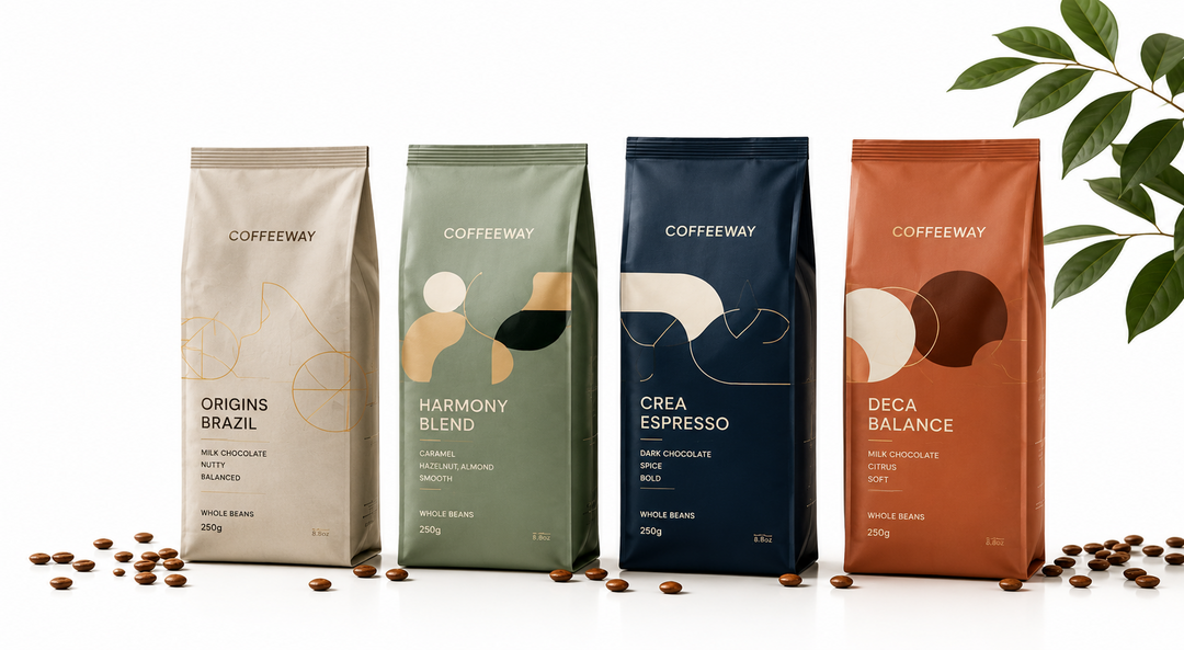
An established coffee brand needed to understand its DNA, and redesign its communication and packaging across its portfolio.
The challenge was not simply to modernize the packs or make them more visually appealing.
In a category filled with familiar visual codes—origins, beans, cups, dark colors, premium cues and increasingly similar claims—a redesign could easily produce attractive packaging without strengthening the distinctiveness of the brand.
The fundamental question was:
How can packaging express the emotional DNA of the brand rather than simply follow the visual conventions of the coffee category?
Diagnostic Insight
Using THE WHEEL OF MOTIVES®, we decoded the brand's emotional DNA.
At its core was the motive to:
CREATE
This changed the packaging challenge completely.
CREATE is about imagination, expression, experimentation and bringing something new into existence.
The brand therefore should not look like another conventional coffee brand.
Its packaging needed to communicate a world of creativity and possibility.
The question was no longer:
“What should the new packaging look like?”
It became:
“What does CREATE look and feel like when expressed through packaging?”
Intervention
Rather than designing from subjective aesthetic preference, the motive became the filter for executional decisions.
We defined the visual and semantic principles that could express CREATE through elements such as color, composition, imagery, typography, graphic language, hierarchy, forms and storytelling.
The guidelines established what belonged to the brand's emotional world—and equally importantly, what did not.
This gave designers a clear creative territory within which to work.
The process moved systematically from:
Brand DNA → CREATE → Emotional meaning → Semantic principles → Packaging guidelines → Redesign
Before
The packaging communicated coffee, but the opportunity was to make it communicate this particular brand of coffee.
Without an emotional system, redesign decisions risked being driven by category conventions, aesthetic trends or individual creative preferences.
A color might look attractive.
An image might feel contemporary.
A typeface might appear premium.
But there was no single strategic criterion connecting these decisions back to the brand's deeper emotional meaning.
The packaging could communicate the category without fully communicating the brand.
After
CREATE provided a common emotional compass for the redesign.
Packaging elements could now be evaluated through one fundamental question:
Does this expression reinforce the brand's creative DNA?
Color became more than decoration.
Typography became more than legibility.
Imagery became more than an illustration of coffee.
Composition, graphics and storytelling could all contribute to the same emotional territory of creativity, imagination and expression.
The resulting guidelines helped redesign the packaging while maintaining coherence across different products and variants.
They also created something more enduring than an individual pack design: a system that could guide future packaging decisions.
As the portfolio evolved, new executions could change while continuing to express the same underlying motive.
The packaging was therefore no longer simply a container carrying the brand identity.
It became a physical expression of CREATE.
The Principle
Positioning is the soul. Packaging is the body.
A packaging redesign should not begin with colors, typography or graphics.
It should begin by understanding the emotional meaning the brand needs to embody.
THE WHEEL OF MOTIVES® identifies that emotional code. Emotion Design™ then translates it into the semantic signals designers can use to create.
In this case:
CREATE → emotional meaning → semantic guidelines → packaging expression.
The result is not a design template. It is a strategic system that gives designers freedom while ensuring that every execution belongs unmistakably to the same emotional world.
Don't redesign the pack. Translate the brand into physical form.
Related materials
Neuro-packaging: Boosting Sales Through Emotions Webinar
People are affected by packaging in ways they do not consciously understand. Shapes, curves, textures, graphics, materials, symbols etc. are never neutral. They all have meaning. Packaging is the pillar that fuses all the consumer touchpoints at the critical seconds of the selecting a brand. It becomes the physical manifestation of the brand, the embodiment of its spirit. Thus, packaging becomes the shorthand of the whole marketing strategy increasing ROI of all marketing actions. Studies show that companies with consistent branding can see up to 33% increase in revenue. Watch concrete examples of how to boost sales through neuro-packaging in this webinar oganized by the Association of the Greek Manufacturers of Packaging and Materials.
Differentiating Brand Purpose in the Eyes of Consumers: A New Method
How can brands build a purpose that is meaningful, distinctive and deeply rooted in who they are?
In this article, Barbara Pederzolli of Barilla explores THE WHEEL OF MOTIVES® and its application to Coffeeway, showing how uncovering a brand’s fundamental emotional territory can align brand purpose, positioning and execution with universal human needs.
The case demonstrates how the biology of human choice can help brands move beyond generic purpose statements to create strategies that are authentic, coherent, emotionally relevant—and difficult to copy.
Have a similar challenge?
Let's explore how human motives can unlock meaning, differentiation and growth for your brand.