
From Material To Meaning
PHASE 3 — CAPTURING BRAND DNA IN GLASS
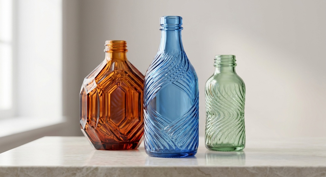
Initial Problem
After reframing the emotional meaning of glass and uncovering TRANSFORM as the company's deeper DNA, the next challenge was commercial:
How could this new strategic meaning change what the company actually offered its clients?
Glass packaging was becoming increasingly commoditized.
Purchasing decisions could easily be driven by price, specifications and promotions, putting manufacturers under constant pressure to compete on cost rather than on the strategic value they could create.
At the same time, global brands were investing enormous resources in defining their positioning, communication and identity—yet the bottle itself was often treated primarily as a container.
The challenge was:
How could the global glass company move beyond selling glass bottles and create packaging with strategic value that could not be reduced to price?
Diagnostic Insight
The breakthrough came from connecting the discoveries of the first two phases.
Glass has the intrinsic ability to TRANSFORM.
The global glass company’s deeper corporate DNA was also TRANSFORM.
But what should it transform?
The brand itself.
Every strong brand has a distinctive emotional DNA.
Yet packaging design frequently begins with category conventions, aesthetic trends, technical possibilities or subjective creative preferences.
We proposed reversing the process.
Start with the emotional DNA of the brand and translate it systematically into physical form.
The bottle should not simply carry the logo.
It should make the brand's positioning visible, tangible and embodied.
This led to a simple principle that would guide the entire approach:
Positioning is the soul. Packaging is the body.
Intervention
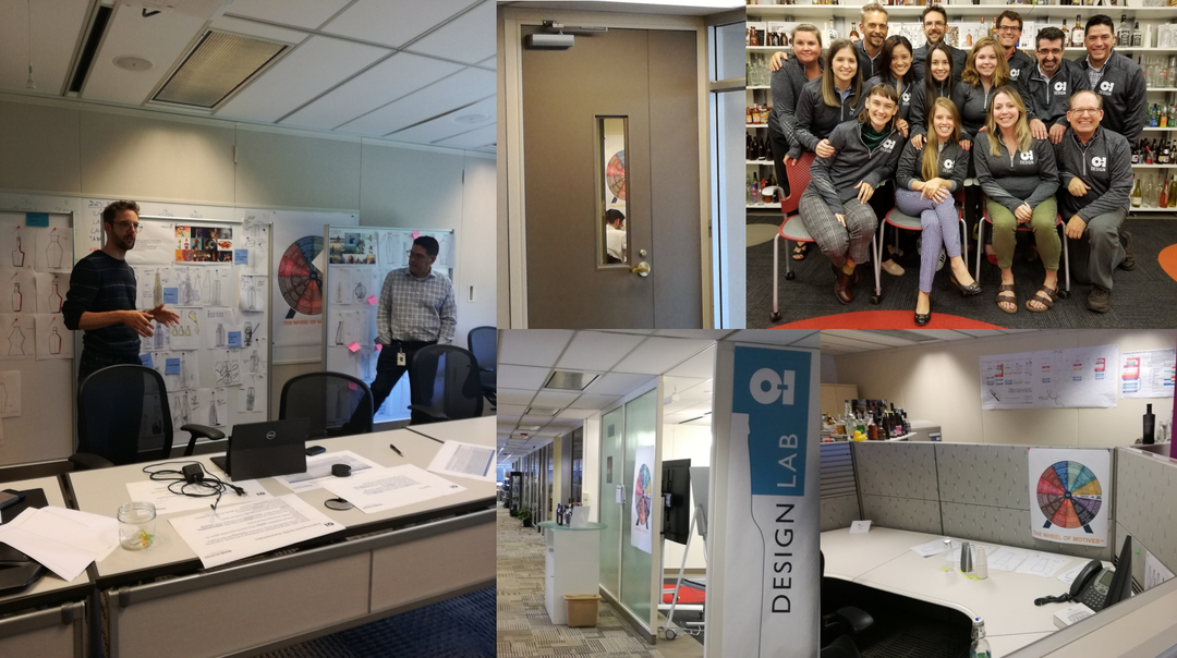
BRAND AVIATORS® and O-I developed a new methodology for translating the emotional DNA of brands into glass packaging.
The process began by decoding two fundamental dimensions:
What does the brand emotionally stand for?
What does the category emotionally mean?
These emotional codes could then be translated into a semantic and sensory design language capable of guiding physical packaging decisions.
Form, proportion, structure, surface, transparency, weight, details and other design cues were no longer arbitrary aesthetic choices.
They became signals carrying emotional information.
The methodology followed a new logic:
Brand DNA → Category Code → Emotional Territory → Semantic Design Principles → Physical Bottle
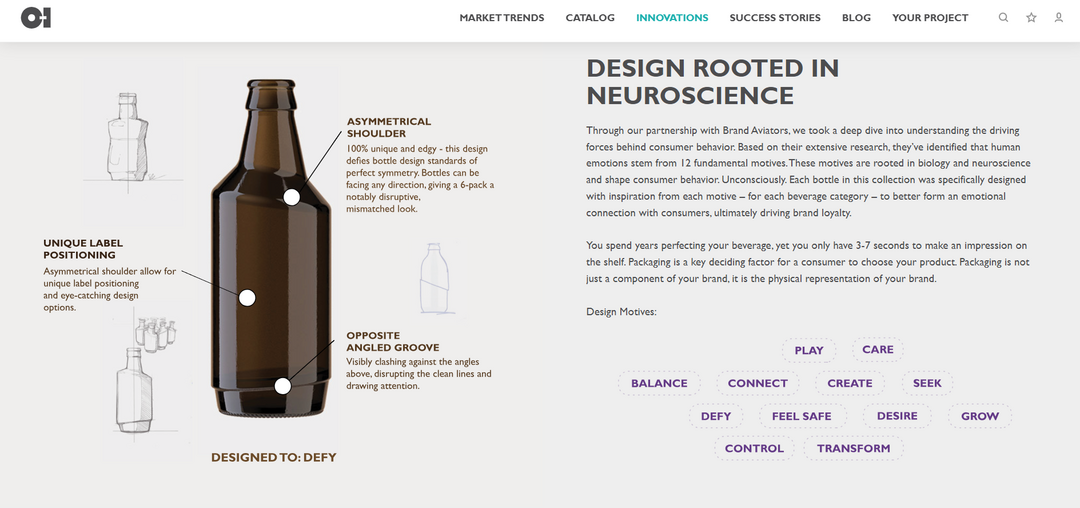
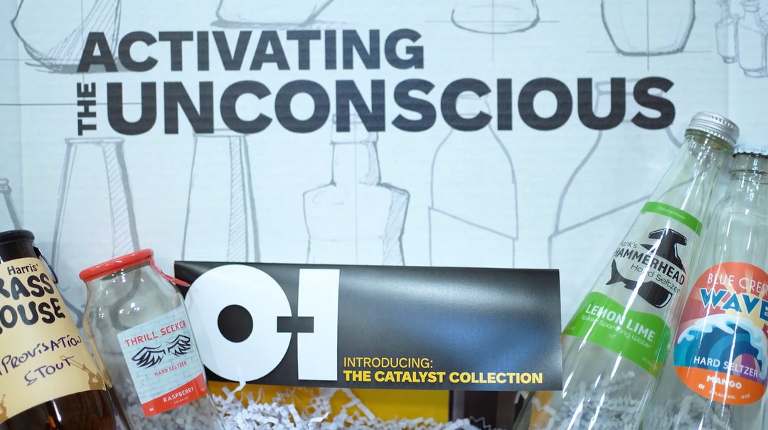
This thinking was also brought to life through the co-creation of the Catalyst Collection—demonstrating how principles of human motivation and emotional meaning could inspire differentiated glass designs.
For larger global clients, the methodology could go further: decode the unique DNA of the individual brand and create packaging specifically designed to embody it.
We were no longer designing bottles around products.
We were designing physical expressions of brands.
Before
Packaging could easily become a battle of aesthetics, technical specifications, cost and promotion.
Designers could create beautiful bottles.
Manufacturers could produce technically exceptional bottles.
Brands could develop sophisticated positioning strategies.
But these disciplines were not necessarily connected through one emotional system.
A brand could spend millions defining what it wanted people to feel while its packaging communicated something different—or nothing distinctive at all.
This created a fundamental disconnect:
The positioning existed in strategy documents.
The packaging existed on the shelf.
The opportunity was to connect them.
After
The methodology changed the role the global glass company could play for its clients.
Instead of entering the conversation primarily as a glass supplier, the company could engage much earlier and more strategically:
What does your brand stand for?
What should people feel?
And how can we embody that meaning in glass?
This helped move the commercial conversation away from price and promotion toward innovation, differentiation and brand value.
The Catalyst Collection demonstrated a new generation of emotionally informed glass packaging, while the bespoke methodology enabled the approach to be applied to major global brands.
Packaging could now be evaluated not simply by asking whether it was attractive or distinctive, but by asking:
Does this bottle physically express the emotional DNA of the brand?
The approach helped position the packaging company as an innovation leader and established a long-term strategic partnership applying the methodology across brands and markets.
Most importantly, it translated the company's new mission into a tangible commercial capability:
Helping brands express their unique DNA through glass.
The three phases had now connected:
Decode the emotional power of GLASS.
Decode the transformational DNA of O-I.
Use O-I and glass to embody the emotional DNA of CLIENT BRANDS.
What began as an attempt to defend glass against competing materials had evolved into an entirely new way of creating value through packaging.
The Principle
Positioning is the soul. Packaging is the body.
A strong positioning should not live only in words, advertising or brand guidelines.
It should be physically recognizable in the product people actually see, touch, hold and use.
THE WHEEL OF MOTIVES® identifies the emotional DNA.
Emotion Design™ translates that DNA into the semantic and sensory signals designers can work with.
Glass gives those signals physical form.
The result is a different philosophy of packaging:
Don't put the brand on the bottle.
Make the bottle become the brand.
Related materials
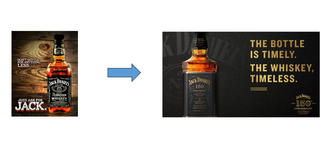
EMOTIONAL CONNECTION BECOMES THE PACKAGING PROPOSITION
The transformation became visible in how O-I itself began talking about packaging: “Glass Packaging that Emotionally Connects with Consumers.”
Moving beyond the traditional language of materials and functionality, O-I positioned emotional connection as a driver of consumer behavior—and glass packaging as a way for brands to create distinctive experiences, express their identity and stand out on shelf.
Emotion had moved from insight to strategy—and from strategy to the commercial proposition.
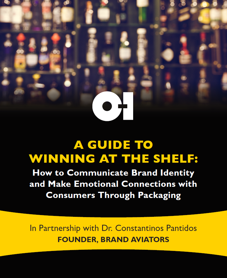
A Guide to Winning at the Shelf
How can packaging do more than contain a product—and actually express a brand’s identity and create an emotional connection with consumers?
Developed with O-I, this white paper explores how brands can translate their unique emotional DNA into packaging, using insights from consumer psychology, neuroscience, and design to stand out at the shelf, strengthen recognition, and build deeper consumer connections.
Because positioning is the soul. Packaging is the body.
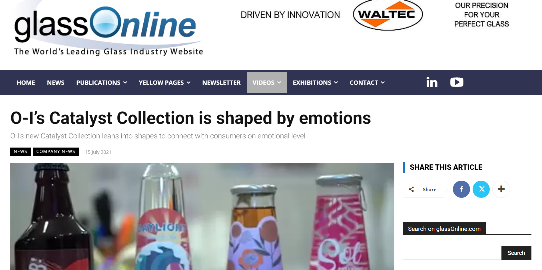
The Catalyst Collection in the Industry Press
The methodology moved from strategy into real-world packaging through O-I's Catalyst Collection—glass designs created using science-backed principles of human emotion and behaviour to connect with consumers beyond conscious product attributes.
As GlassOnline reported, the collection applied these principles to shape, sensory experience and glass design to help brands stand out, create emotional connection and build loyalty.
The idea was becoming tangible: emotion could be designed into the bottle itself:
When Packaging meets Neurosience
The new approach brought together two worlds traditionally treated separately: packaging design and the science of human behavior.
Under the proposition “Leverage the Power of Packaging and Neuroscience to Emotionally Connect with Consumers”, packaging becomes more than a visual or functional object. It becomes a system of sensory signals—shape, color, texture, material and form—that can influence how consumers perceive and emotionally experience a brand.
The objective was no longer simply to design packaging that gets noticed, but packaging that connects:
Leverage the Power of Packaging and Neuroscience to Emotionally Connect with Consumers
From Motive to Market: Designing for Balance
The methodology moved from principle to real-world application with Evenly Wine, a concept designed around the fundamental human motive of BALANCE.
Rather than beginning with aesthetics alone, the emotional territory provided the design brief—guiding how the wine and its packaging could express harmony, equilibrium and balance through the signals consumers experience.
A human motive became a brand concept. The concept became packaging. And the packaging made the emotion tangible:
Have a similar challenge?
Let's explore how human motives can unlock meaning, differentiation and growth for your brand.